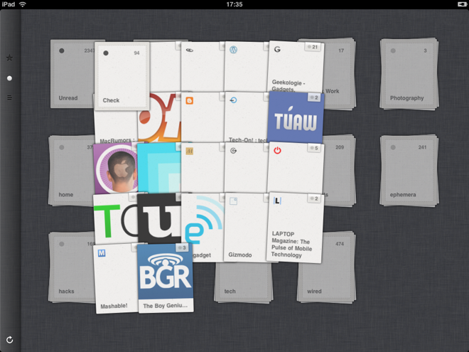
Last week I was rereading Matt Gemmell's post "Finger Tools" and it really got me thinking more about the direction that app design should be headed for mobile devices. Most apps up to this point implement what I would classify as Event Driven Design (EDD). A user clicks/taps a button and is event/action is fired off and then you are presented with more navigation/action choices. Repeat/rinse. Inherently, there is nothing wrong with this. People are used to pressing buttons to get what they want. However, this design implementation is counterintuitive to mobile platforms and where they, especially the iOS devices, shine. Using gestures, multitouch, taps, swipes, etc. Matt Gemmell sums this up pretty well:
"One annoying thing about desktop UIs that has also appeared on touchscreen devices is the “verb then object” style of interaction, or what I call “ink dipping”. You pick a tool from some globally-positioned area (like a toolbar or palette), then move to where you actually want to use that tool – like having to periodically re-dip your pen in an inkwell. It requires a lot of unnecessary hand-movement, and breaks the idea of “direct interaction” to a certain degree."
The reason that most apps, up to this point, have followed EDD, is the lack of screen "real estate" on the phone to really exploit gestures. However, one of the early examples of breaking this mold was Tweetie creator Loren Brichter by adding in the ability to quickly get to tweet actions, by 1) swiping the uitableviewcell for a given tweet and 2) the now ever popular "pull to refresh". With the release of the iPad all bets where off. What was an acceptable practice on the phone for ui design is now flat out boring on the iPad. I now expect iPad apps to get away from standard hierarchy navigation and app flow. Using gestures and "direct interaction" feels more natural. I try as best I can to not be a hypocrite and spent quite a bit of time re-evaluating my own app designs moving forward. As a consequence I came up with three different "direct interaction" mechanisms which I am currently looking to have patented so I can't go into details yet, but if all goes well then it will show further examples of how people interact with their device that goes beyond buttons and clickable menus…what I would refer to as 2 dimensional navigation and moves in a realm of a "Gyroscope" navigation and interaction.
Examples of "Direct Interaction"
These are apps that I use and or am inspired by for different types of navigation in an app.


