Thoughts on Why Event Driven Design is Not Very Mobile

Last week I was rereading Matt Gemmell's post "Finger Tools" and it really got me thinking more about the direction that app design should be headed for mobile devices.  Most apps up to this point implement what I would classify as Event Driven Design (EDD).  A user clicks/taps a button and is event/action is fired off and then you are presented with more navigation/action choices. Repeat/rinse.  Inherently, there is nothing wrong with this.  People are used to pressing buttons to get what they want.  However, this design implementation is counterintuitive to mobile platforms and where they, especially the iOS devices, shine. Using gestures, multitouch, taps, swipes, etc. Matt Gemmell sums this up pretty well:

"One annoying thing about desktop UIs that has also appeared on touchscreen devices is the “verb then object” style of interaction, or what I call “ink dipping”. You pick a tool from some globally-positioned area (like a toolbar or palette), then move to where you actually want to use that tool – like having to periodically re-dip your pen in an inkwell. It requires a lot of unnecessary hand-movement, and breaks the idea of “direct interaction” to a certain degree."

The reason that most apps, up to this point, have followed EDD, is the lack of screen "real estate" on the phone to really exploit gestures.  However, one of the early examples of breaking this mold was Tweetie creator Loren Brichter by adding in the ability to quickly get to tweet actions, by 1) swiping the uitableviewcell for a given tweet and 2) the now ever popular "pull to refresh".  With the release of the iPad all bets where off.  What was an acceptable practice on the phone for ui design is now flat out boring on the iPad.  I now expect iPad apps to get away from standard hierarchy navigation and app flow. Using gestures and "direct interaction" feels more natural.  I try as best I can to not be a hypocrite and spent quite a bit of time re-evaluating my own app designs moving forward.  As a consequence I came up with three different "direct interaction" mechanisms which I am currently looking to have patented so I can't go into details yet, but if all goes well then it will show further examples of how people interact with their device that goes beyond buttons and clickable menus…what I would refer to as 2 dimensional navigation and moves in a realm of a "Gyroscope" navigation and interaction.

Examples of "Direct Interaction"

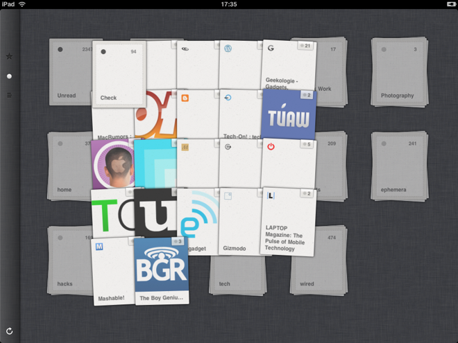
These are apps that I use and or am inspired by for different types of navigation in an app.

iPadReeder.png

twitter_pane1.png

ipad_touches.jpg

Customizing UIActionSheet Buttons

One of the great benefits of iOS development is that Apple has provided the ability to customize almost any element thus not limiting a designer or developer with a stock look and feel.  Just take a look at subtle examples in Twitter for iPhone to the extreme of the Outside Weather app or Starbucks.  I am working on a nice size project and one of the requirements is to have the UIActionSheet buttons be a different color than the default gray color.  This turned out the be as straightforward as trying to change the look and feel of a tabbar.

::NOTE TO APPLE:: Customizing Tabbars and UIActionSheet buttons should be a lot easier. ::END NOTE::

It took a few hours, but I finally knocked it out.  At first glance I figured that each one of the buttons would be an instance of UIButton and I could located them in the view hierarchy and just update the background color either in a delegate method or subclass UIActionSheet and override drawRect:.  NEGATIVE.  

My next possible approach was to create my own custom view(s) and slap them on the UIActionSheet's main view and send everything else to the back.  Granted that has worked for some people and is a totally viable option, but I found it to be a very hacky solution for what I was doing.

After looking up a few questions on StackOverflow it turns out that sometime after iOS 3.1 the subviews in the UIActionSheet are an undocumented class instances of UIThreePartButton.

::BIG DISCLAIMER - YOUR APP WILL PROBABLY GET REJECTED IF YOU SUBMIT WITH THIS TECHNIQUE::

After digging up that little nugget about UIThreePartButton I finally had turned a corner.  The next hurdle was trying to find the correct method to use from the UIThreePartButton class to change the background color.  Unfortunately, there isn't a backgroundColor property for that.  Granted since I am dealing with a class that inherits form UIView I could set the subviews backgroundColor property to [UIColor redColor], but when I did that I didn't get the expected result of a button with a red background.  The button became a red tint and the view behind the button was red as well.  Obstacle.  Looking at the methods/properties that I DID have I went on a little intuition that Apple wasn't using a color, but a stretchable background image for the button.  I grabbed the background graphic that I wanted and used - (void) setBackgroundImage:.  SUCCESS!!!!!!!

I wasn't quite finished.  Background button was what I wanted, but I needed to change the font color from black to white.  But wait there isn't a method to set the font. However, UIPushButton inherits from UIThreePartButton so once again going on an educated guess/intution I was able to use setTitleColor:forState: and perfection.  Excatly what I wanted and needed.  UIActionSheet with red buttons and white font.

Even though I can't submit any app to the AppStore because of the undocumented class working through the exercise was very enlightening in the areas of ui customization, design patterns and general problem solving skills which should always be in the top of a developer's skillset.

I posted my example on github.  It was compiled with 4.0 with XCode 4 Preview 3, but XCode 3.x should work.  If you run into any problems then let me know.

(Near) Future of iOS Development - A Prediction

Last week Apple held a press conference to announce their new line of iPods, upcoming features/releases for the iPad and changes to their investment hobby, AppleTV.  I am not going to go into a long diatribe into my personal opinion of the devices themselves, but rather what most people might have missed as to the future of Apple devices in the future and what has been in the works for quite sometime.

Back in 2009 I went to the WWDC and during the keynote address, there a particular slide that talked about the increasing similarities between OSX and iOS APIs and frameworks.  Since that time the gap has shrunk dramatically and by the look at the latest offerings and recent patents Apple is working feveriously to unify it's platforms.  Yesterday the 4.1 OS was released for the phones and touches. In November, the 4.2 OS will be released, hopefully unifying the iPhone, iPad, iPod Touch and the AppleTV.  Yes, the AppleTV, I predicate will be touted as running the latest iOS and better yet will be an open platform for developers to write and run native apps on, thus rounding out it's stable of iOS devices.

One of the first questions I get when I make that statement about the AppleTV is how would you handle the touch gestures?  Easy...Magic Trackpad will be paired with the AppleTV. Problem solved.  I was hoping Apple was going to announce this functionality last week, but I can see the touch gestures on the wall and it is coming....SOON.

If my predictions are true, what does this all mean for developers and consumers?

For Developers
More avenues for app development that one could have ever dreamt to this point.  The most important aspect of this is that we will have a unified platform to work with.  You will have the choice of concentrating on one or more devices to develop for.  "Write once run on any Apple device".

For Consumers
You will have a similar experience using your apps when going from device to device and medium to medium.  No other company offers that right now.  I have yet to hear any synergy between Google and Microsoft devices.  The concepts and principles of a great UX that are embedded in Apple's DNA will not have to be confined to a desktop or mobile handheld device, which is what most people what.  Using an iPhone, iPad, AppleTV or iPod device should provide you with the almost the same, if not, the same user experience.

What I Predicted Before the Sept. Event on July 8th, 2010

You can never trust Steve Jobs.  A few years ago he was asked about tablet based computer and he denied that Apple was interested.  When there were rumors concerning the first iPhone...once again he denied it.  Late May or early June at the D8 conference someone asked about AppleTV and Steve's response was that it was a hobby for Apple and that a lot of effort wasn't going to be put into it because cable boxes now where subsidized and that consumers didn't want yet ANOTHER box to hook up to their TV.

I think he is lying.

Though the article points out that Steve is a HUGE stack holder in Disney and Pixar, he has a more personal desire to see it do well and it has to do with his legacy with Apple.  With a successful launch of a true home media center via AppleTV, Steve/Apple will have completed the conquest of all things media (iTunes, iPhone, iPod, iPad, iBooks).  Though Google might come out with GoogleTV first, much like TiVo, they will be lacking the purplecow factor.  In addition, both will run their interace with Flash and not WebKit which is doomed for failure.

Apple will take their time, roughly two years, and come out with a product that is TOTALLY revolutionary and will run iOS.  What that means from a consumer standpoint is there will a synergy between all their media (pictures, music and video) and all of it will be stored in the cloud. Don't forget they bought out lulu.com and don't be surprised if Apple tries to make a move to purchase Netflix.  People thought it would just be for storing your music purchases in the cloud, but Apple always thinks bigger.

From a business/developer point-of-view....those applications like Plex need to be thinking about survival between now and then because once it is released developers like myself won't have that reliance of other frameworks, services, hardware, etc. anymore....you can write your own native apps to integrate into AppleTV directly, which is now your media center. No middleman.

Tapworthy iOS Apps Aren't Developed Overnight

With each day that passes the popularity of the iOS devices keeps heading to "infinity and beyond" (I have a two year-old give me a break).  With that comes the "urgency" for companies now to get an app.  While that is a legitimate need, and helps us developers in lucrative business, there is still this mindset that apps can be done overnight.  Well, I guess they can, but it won't be good at all.

I was skimming through Tapworthy, and this book in the FIRST chapter puts it perfectly and something that individuals and companies need to pay close attention to when they say they want an app.

"you do need an iPhone app. Apple’s glossy gadget touched off a whole new kind of computing - personal, intimate, and convenient - that has become both passion and habit for millions of regular folks. That’s not going away; looking ahead, we’re not going to spend less time with our phones, our tablets, our on-the-go internet devices. More and more, getting in front of people means getting on mobile devices, starting with the iPhone. It’s a device with the following and technology to get your stuff out there with a rare combination of volume and style.

An iPhone app isn’t an end in itself. It’s not something to be hustled through, just so you can check it off your list. There’s a whiff in the air of the go-go website panic of the 1990s, when everyone rushed to cobble together some HTML just to have a website, any website, with little consideration of either usefulness or usability. It was at once a period of heady innovation and herd-following mediocrity. The same holds for iPhone apps today. There are mind-bending creations to be found in the App Store, but the store is also chockablock with time-wasting duds. You can do better."

Tapworthy - Designing Great iPhone Apps
ByJosh Clark

Creating a Universal iOS App Tutorial

Just when I thought I had a somewhat decent grasp on developing and deploying iOS apps Apple came out with the iPad and threw a whole new element in the mix when it comes to developing.  Thankfully, the iPad will allow iPhone apps to run on the device, but the user experience is definitely sub-par.  So what is the best approach to providing an native iPhone app and a native iPad app?  The first option is to duplicate your existing iPhone app code base and modify all your views and some of the controllers to take advantage of the features in the 3.2 SDK.  The problem with that is the massive DUPLICATION of code and to be honest it seems quite lazy.  I have seen lots of examples where developers use the idiom check for which device is being used, as well as, runtime checks for selectors in order to leverage the correct methods/classes for the given device.  While this is certainly a better approach then having two separate code bases with 90% of the same code you now have code that is sprinkled/littered with if/else checks.  Unfortunately, you are once again stuck with code that will be maintainable for long.  After reading the chapter on universal apps from the upcoming book from Pragmatic Programmers, iPad Programming, I found a much better design pattern of splitting out the app into Shared, iPhone and iPad resources, classes and delegates.

As a side note, due to the ever exponential growth of iOS device popularity developers are not going to have the bonus of just jumping straight into writing an app like we did when there was just the iPhone.  A lot more thought needs to be given to design patterns (especially regards to the quality of your MVC) and application flow.

In order to make life a little easier on myself since a few universal apps are coming in my near future I decided to create a basic "template" for a universal app.

Features
  • Compiled for 3.2 and 4.0
  • Utilizes navigation controller based app for iPhone device and SplitViewController for iPad
  • Shared "model" class and controller classes
  • Separate resources (classes/xibs) for the different devices

Comments and improvements are ALWAYS welcome.  One improvement that I know I want to make is having the "detail" controller from the SplitViewController to be a UINavigationController.

(Order of the) Phoenix Communications

From the ashes of itself, according to legend, a Phoenix will be reborn to live again.  In my case this almost has a literal truth.   Last week I started my new job at Phoenix Communications as a Software Development Engineer.  My primary responsibility will be creating iPhone/iPad apps for business integration, as well as, consumer apps which I can't go into detail right now due to NDA...but I can say that it is going to be challenging and exciting.  Most of my previous work experience has been with fairly large companies or academic institutions.  While, I learned a lot working in those settings I definitely feel that I work BEST when I am involved with a smaller team and even smaller bureaucracy.  Too many ideas and innovations are stifled because of "red tape" or this approval or that approval needs to be signed off on by five different levels of management.  There are usually WAY too many meetings and not enough work getting done.

Not anymore.  I love the fact that I am up to my Phoenix feathers in ideas, responsibility and most importantly...coding.

'Freedom From Porn': Steve Was Right

Back in May Steve Jobs got into a wee bit of email confrontation with Ryan Tate over the finer points of whether or not Apple was still a revolutionary company based upon their recent actions of going after the Gawker blogger/journalist/thief/revolutionary/martyr/whatever for publishing and printing information on the yet release iPhone 4.  One of the most circulated quotes from sed email exchange was "freedom from porn".  Even as a big Apple supporter that I am I had to laugh a little.  I do think Steve and his band of merry men and women are making the right business decisions I thought that one particular reasoning was somewhat of a copout used by politicians who want to guilt voters into believing in some draconian policy.  That was until I was watching my 3 year old niece play a Snow White puzzle game on my brother-in-law's Android Incredible.  The app was free with ad support.

Disclaimer: I FIRMLY believe that it is a parents responsibility to monitor what their children are doing online.

I was completely shocked when I saw an ad for "Sexy Single Chat Line" on a kids game.  People complain how Apple has "jump the shark" or "sold out" by having tight control on the advertising model of iAds or the submission process of apps, but having a completely "open" system is not necessarily a good thing. Apple has struck the right balance between along enough flexibility for developers to be create wonderfully creative and useful apps, but in the meantime maintaining a high standard of quality. 

Needless to say the app got deleted immediately and she played a similar game on my iPhone.

JandB Photo App Officially Launched

The past three months I have been working on an iPhone app for a local photographer John Childress.  Like most great iPhone apps, the idea that John had dealt with a concept that would:
  1. Get him iPhone app market for his business
  2. Provide a new value-added service to his customers
  3. Providing a new form of media to promote his business to potential new customers
In doing research for the app he and looked at a lot of other photo gallery viewing apps in the App Store to see what features dominated and most importantly what could he offer that others didn't.  Currently, after you have a photo shoot John will send you a gallery code and you can then view the flash slideshow on his site.  There are few issues  with the "mobile" market that we all live in now.  The first is you can't view flash on the iPhone so trying to view your photos on the phone and show them off to friends and family is not possible.  Rewriting his gallery website to be non-flash would be a good idea, but the system is currently in place and is integrated with his core business aspects.  The other roadblock that he runs into is that most people want to view slides shows with a soundtrack. 

*I think I just heard the RIAA scramble to call their lawyers for a lawsuit just for a business thinking of doing that*

With the JandB Photo app, which is a free download, users can add a gallery to their phone and enjoy the slideshow of images with an optional custom soundtrack from tracks on your phone.  Want to share a picture on Facebook?  Not a problem that feature in there as well.  Want to view current specials that John is offering, there is a place for that.

What I really love about the app from a consumer point-of-view is that it is simple and straightforward.  There is not guessing about what to do.  A specific task is performed in the least amount of steps.  You don't have to think.  From a developer's point of view this app was one of the more challenging apps I have done and learned a lot.  The app uses two complex frameworks.  Three20 and Google's objective-c framework.  Though integrating these components took sometime and I went through a few glasses of wine for support, both saved me COUNTLESS hours of custom development.

Three20 Modifications
Apple should really be THANKING @joehewitt for this work his creation of the Three20 framework.  Especially the photo gallery/viewer components.  If it wasn't for Three20 then I am sure that developers would be rioting outside of 1 Infinite Looper Cupertino, CA for the lack of such important piece of built-in functionality.  With all it's glory though I did have to make some modifications which include integration of posting an image to Facebook and adding in the ability to play an playlist that is associated with the gallery.  Unfortunately, and I plan on working on this soon, I had to modify the core source which to be frank felt dirty.  I just didn't have time to write classes extensions and categories for the gallery controller and viewer controller.

Google Objective-C Library
Man there really is a lot going with this library.  Everything and the kitchen sink.  When scouring through the wiki page for this I didn't see a lot of really good iPhone examples, but I was able to piece together what I couldn't figure out from their Mac example to modify a document and worked without a problem.  My only real disappointment with this library is that there, IMHO, waaaaaay too many delegate methods and callbacks.  With that being said I do understand why. Google gives you granular control of the content, metadata, revisions, ALC, etc. and objective-c is verbose so the end result is a lot of code to accomplish what I need which was: lookup a document by a given name, grab the latest revision, insert text at the end, close/save the document.

All in all I am very happy with the app.  The first few future releases will mainly deal with performance.  I still feel that I could squeeze some more performance on parsing through the images on the server side and optimize the network calls on the phone.  After that some UI tweaks. To me the gallery listing could be a little prettier.  Most importantly any enhancements that users want to see.  Feedback is always welcome.
Head over to the App Store and check it out.  If you want a check another gallery besides the default, then use "McKinna", without quotes.  Shameless plug for my daughter.

How to Create SMS Ballon iPhone Table View

I was working on incorporating an "sms ballon" type view for a client and while doing some research on the best, and different, ways to implement the functionality I came across a great tutorial, but thought it could be cleaned up just a little bit which should make your FPS increase and I fixed some memory leaks.  I wasn't able to run any performance tests on it so I would welcome ANY feedback how to improve the code.

The key to making the "ballon" background grow and shrink based upon the amount of text is using:

UIImage *balloon = [[UIImage imageNamed:self.imgName] stretchableImageWithLeftCapWidth:24 topCapHeight:15];

If someone has any advice on how to make the font look better please let me know.

UILocalNotification Example Project Using iOS4

One of the greatest new features that is included in iOS4 is the power that developers have to deliver local notifications.  At the time that the first beta was released in April I was writing specs/requirements and project timeline for a potential app which would have ended up taking me about 5 months to develop.  A large part of the project schedule dealt with having to setup/maintain user reminder preferences...the number of reminders, frequency of each one, time zones, etc.  I tried to think of ever solution that I could that didn't involve the server component, but there really wasn't any other way.

UILocationNotification to the rescue.  After looking over the API docs, Apple had provided exactly what I needed and I was able to cut out 2.5 months from the project schedule because of it.

I was able to create an POC app using UILocationNotifications in literally 5 minutes.  It involved two easy steps:


  1. In the app delegate class I added the following method to verify that the event was fired off if the app was running. -(void)application:(UIApplication *)application didReceiveLocationNotification:(UILocationNotification *)notification;
  2. In the -(void) viewDidLoad method of my controller you alloc/init a new UILocationNotification object, set the fireDate which is an NSDate object, what time zone you want, what the notification message(body) should be and then add the UILocationNotification object to the UIApplication scheduleLocalNotification method


There are two possible end results.  The first being that the event is fired off while the app is running in which case you will not see anything. Hence, why I added the NSLog to the didReceiveLocationNotification method.  The second is if you close the app before the notification has fired and in that case you will receive the alert box with your message.

Download XCode Project

Note: This was compiled with iOS4 GM and tested on iPhone 3G/3GS