Please Enter Your Password Gesture

The more and more that I develop apps the more I try to challenge myself to come with creative ways for users to use the apps. Really trying exploit the power of multi-touch. As mentioned in a previous post, this trend is becoming more and more mainstream. Unfortunately, when it comes to authentication, we are still stuck using the old attage of a PIN and/or using biometrics, which never really caught on with the masses. I personally think that has to do with implementation of it not the mechanism.

In order to try and contribute, to a hopefully better way to authenticate, I started working on a password gesture framework. Though password gestures aren't new what I think differentiates mine, at least conceptually, is how it deals with resetting it. My first thought was to just stick with the same old "email me my password", however email isn't always relaible and the "gesture" password isn't stored on a server, but on the device. In addition, I didn't want to have to rely on a separate server or component. Lastly, by doing that I am relying on an outdated "desktop" thought process of handling lost/forgotten passwords. So how do I give a user a usable and easy way to reset their password without having a server dependency or leaving the app?

My solution is that during the password setting process is to present the user a list of pictures and have them choose N out of X. If they need to reset their password they will be presented with the "reset" picture screen and select the correct ones. If the correct set of pictures are choosen then reset occurs. If not then fail. Due to my extremely busy schedule I haven't had the opportunity to really dedicate the time I want to. I am hoping that posting this to github that the iOS community will take it and make suggestions or fork and implement it with ideas and features that I haven't thought of.

I have started the project as a sample app, but once it reaches a stable point I will make it a static library that can be dropped into any project.

It goes without saying that I am really looking for feedback on this. All comments and suggestions are welcome.

Password Gestures on Github
Using CAAnimationGroup for View Animations

Lately I have been pushing myself to increase my knowledge and understanding of more advanced animation techniques. The more that I
dig into the lower level
core graphics framework and core animation the more impressed I become with their power. I also have a greater 
respect for those developers who can leverage their power in creative ways.

For most use cases leveraging
uiview basic animations with blocks will do exactly what you need. However, in my particular case I wanted to
accomplish the following. Scale, rotate and change center point of subview "A" to subview "B" all at the same time.

Taking my own advise I first started down the path of using basic uiview animations. I want to make sure that each different piece of
the animation would perform the way I wanted them to. Separately, they did exactly what I wanted. Unfortunately, grouping these together was
not going to happen with uiview animations.

When I ran the process all the animations executed, but the transition to subview b's center point was very jerky. To make sure that I didn't
miscalculate any of the individual animations I went back and tested each one separately. Each animation ran smoothly. When I ran the group within the block
I had the jerkiness problem of animation the center point.

After going back and reviewing Apple documentation I found what my problem was.
Imagine that. To do the rotation I apply a transform on
the view's layer. However, the transform performs it's animation based upon the views center point. Since I was trying to apply an
animation on the center point as well the group animation had to reposition subview A's center point first before it could apply any of
the other animations. Hence the jerkiness.

I pushed all my animations to a
CAAnimationGroup and all the transitions were performed.


-- 
Cory D. Wiles
kwylez@gmail.com
www.corywiles.com | twitter.com/kwylez

Ordered Results using DirectoryIterator

No matter if you are beginner or expert one of the most command tasks that you  will do is writing some class/script/snippet of directory iteration.

"Get a list of files/directories and display"

With PHP there are about baker's dozen different ways of accomplishing this.  In the beginning there was functional verbose way:

It gets the job done, but not very extensive and it seems VERY verbose.  Being that my development background started with OOP I was never a fan.  Fastforward a little bit and PHP introduced "dir", which returns an instance of the Directory class.

Not to bad, but still verbose and God forbid that you have to do recursion.

With PHP5 came the SPL. Standard PHP Library, which still to this day I don't know why it isn't prompted more. Pure object-oriented and has the flexibility to accomplish the basic tasks set before them, as well as, the strength to be a customizable as the developer wants.

The class which most use for directory iteration is…hold your breathe: DirectoryIterator.  In my use case I need to server up image path and meta information in an HTTP request so that an iPhone app could parse the response and grab the appropriate images for display.

Basic usage:

See how easy that was.  OOP at it's best except for one little thing.  The images were not coming back in the correct order.  They are named on the filesystem: "00.png", "01.png", "02.png", etc., but the return was random.  While I can appreciate DirectoryIterator being a more "abstract" enumator and not really having a "natural" sort order I still was frustrated.  Remember, what I said earlier though about the SPL being customizable and OO.  You can subclass the DirectoryIterator and supply your own comparator, which by design, is best practice for a large system.  I, however, was looking  for the shortest line between two points and creating a subclass seemed overkill.

*I really wish PHP had categories like Objective-C or method swizzling

Not a problem though.  I can just pass a callback function to the usort function and call it a day.  H.O.P.  This logic does work, but the array that I wanted to sort is associative so the key that should be sorted is "name". The callback function for usort ONLY accepts two arguments which it compares.  I had to bake in the key which isn't flexible.  I would rather reuse the functionality by being able to pass in the key to sort on. PHP isn't the only language that has this result.  If you look at the behavior of an NS(Mutable)Dictionary in objective-c which makes copies of keys, so the objects in the key array will be different. Objective-C offers the ability to pass in a comparator when iterating over the dictionary so that the sort order is defined by the developer not by the hash.

In a perfect world I would be able to do the following:

Here is the example script for my use case. (changed some path names for security reasons)

Custom UIActionSheet Using Core Animation

About four months I posted a blog and project that showed how to customize the buttons of a UIActionSheet.  In the disclaimer I stated that because of the use of the private api's if you attempted to submit your app with this technique to the App Store it will get rejected.

This time around a created a simple, yet effective customized, mock UIActionSheet.  Essentially it is just a custom UIView with three buttons that animates and dismisses just let an UIActionSheet.  All you have to do is assign a method to each of the buttons.

If I have time then I'll try and make it even more extensible by creating a custom delegate to make the classes even more reusable.

Memphis BarCamp 2010 Experience

This past Saturday I participate in my first BarCamp here in Memphis. Most of the user groups and conferences that I attend are very technical in nature and while @barcampmemphis did have technical discussions and developers there it was a good mixture of marketing and general interactive as well. My presentation, The Fine Print of iOS Development, was one of the ones voted on to be presented. However, my session wasn't until later that afternoon so I had some time to kill. I went and listened to a few sessions, but what I enjoyed the most about BarCamp was the networking and general conversations between the people in the various industries. Due to the nature of my talk I had a lot of preliminary sidebars with a few marketers which was great because that is who my presentation was geared toward. I made some slight changes to my deck as a result.

One the most asked questions I got was "Why should someone have a native iPhone app instead of a mobile web app?" I gave my two cents for the pros and cons of both, but there was one particular company's experience that I have been thnking about a lot. Not to pop my own collar but I think their experience exemplifies why agencies and marketers should hear my talk. The individual that I was talking to worked for Company A. Company A sells a particular service which currently has some pretty steep competition. Early this year Company A hired Company B to build an iPhone app for their service. The app was submitted in the early summer and has yet to be approved by Apple. I asked why not and person from Company A explained that company b wasn't getting a straight answer from Apple and that Apple keeps changing the rules. At the time I didn't think it was my place to really say anything about Company B because I didn't know them nor their circumstances of the app functionality. It was unfortunate for Company A because they are falling further and further behind their compition as a result of this. In addition, Company A now thinks that investing in an iPhone app is a waste of time and money and that it would serve their users better to just have a mobile web app.

After doing some research on Company A's service and the company they hired....sorry Company A, but you hired people who don't know what they are doing. The amount of time between the first submission and now should have been more than enough to get the app fixed unless Company B is using private API or mimic apple logos, copyright functionality, not following the human interface guidelines, etc.  I have been submitting apps to the app store for over a year now and even when something is rejected Apple has been pretty clear about it and even helped me the resubmission process. Something isn't stirring the koolaid here. Yes I know about the Google Voice debacle but trust me nor Company A nor B are Google. 

The lesson to be learned here is that agencies, marketers, companies in general need to:
  1.  Watch my presentation
  2. Understand that if your app is rejected, Apple will work with you on the resubmission or provide a pretty straight forward answer as to why they wont except it. Company B should have known this and been able to fix the problem and not thrown up their hands and blamed Apple for their mistakes to Company A.
  3. Having a basic understanding of underlying technology of iOS devices from an abstract point of view will save you countless hours of frustration.
All and all I really enjoyed being apart of BarCamp and especially being a presenter.  I look forward to future events and hopefully presenting again.

Upcoming to Universal iOS App on GitHub

In anticipation for the upcoming public release of iOS 4.2, I have updated my Universal iOS App project (iAd Branch).  The project will run on 3.2 and up with iAd support for iPhone and iPad (4.2 only for iPad).

I ran into some interesting hurdles while working on this update.  The first of which is that adding in iAd support for a project using a UISplitViewController SUCKS! #FAIL When iAds where first offered in the 4.0 iOS they came in two different size: 320 x 50 (ADBannerContentSizeIdentifier320x50) and 480 x 32 (ADBannerContentSizeIdentifier480x32) which served their purpose since you could use iAds only on the phone.  When iAd support was added for the iPad Apple was smart and deprecated those properties and added ADBannerContentSizeIdentifierPortrait and ADBannerContentSizeIdentifierLandscape, thus abstracting the dimensions that are available for any current and future devices.  This unification works great on the iPhone and iPad...except for when you implement UISplitViewController on the iPad.  The reason being that even though your root view or "detail" view controller are in landscape or portrait mode their widths aren't in the expected frame width for either choose of iAd. Thus you get an inaccurate display and you will an error in:

- (void)bannerView:(ADBannerView *)banner didFailToReceiveAdWithError:(NSError *)error

stating that an ad has displayed but is being obscured. In order to get around this I had to add in some padding to readjust the 'y' coordinate for the tableview's frame (only when the ad appears).  Why the rotation, and only on the iPad, gets screwed up I am not sure at the moment.  I created a simple, iPad only project and got the same results so there might be a bug, but until I am able to verify, my "padding" works".

It is important that if you clone/run this project that you read the debug console for iad display errors.  These are relevant errors passed to the delegate method and don't have to do with my code.  You will notice in the video that ad fails to load the first round.  This is due to an error from Apple serving up the ad because inventory is not available. Second time is the charm.

*important - always implement delegates to handle failures

In the next few weeks I'll be adding a branch where the Universal app will have Tabbar support.

CWCustomAccessoryView - Custom UITableViewCell AccessoryView

Around the same time that Oliver Drobnik (Formely Dr. Touch) published his blog entry, Custom-Colored Disclosure Indicators, I was also in the middle a client's project where the table view cells each had a different colored uitablviewcellaccessory.  I had to deal with 20 different images for the accessory views (10 for pre-iPhone4 and 10 for retina display).   At the time I knew having to manage the images themselves and the code to display those views was unwieldy and cumbersome.  I took inspiration from Oliver's post to come up with a class, CWCustomAccessoryView, which allows the developer to customize the way the accessoryView for a cell looks which includes the stroke, _>_, and fill color.


Though the code is almost a month old and I haven't had that much time on improving it, but after reading Ray Wenderlich's blog on Arc's and Paths I see I need to make the accessory view look for like Apple's detail disclosure button to make everything look really polished.

Per usual the code is hosted over at GitHub.  Comments and improvements are ALWAYS welcomed.

Force UINavigationBar Back Bar Item Display

The latest project that i have been working on has the CRAZIEST workflow that I have ever experienced.  The app isn't in the app store, but is used as a sales tool for the type of services that their company can offer.  Surprisingly, at least to myself, I was able to come up with my own navigation controls to manage the workflow.  The workflow consisted of various tabbarcontrollers, uinavigationcontrollers, fullscreen views, some with navigation bar, some without.  What ended up being the trickest parts to deal with was handling the transitions between full screen views and views with the navigation bar along with the back button.  My first attempt in the transition worked except for the fact that the back bar item was BEHIND the uinavigationbar titleView.

The problem was that I was setting the back baritem to visible in viewWillAppear:animated: and then calling setNeedsDisplay on the navigationbar.  That works, but the "refresh" of the view and animation would stop once the method ended.  The fix ended up being setting the back baritem to hidden and refreshing the navigationbar in viewWillAppear:animated:


Thoughts on Why Event Driven Design is Not Very Mobile

Last week I was rereading Matt Gemmell's post "Finger Tools" and it really got me thinking more about the direction that app design should be headed for mobile devices.  Most apps up to this point implement what I would classify as Event Driven Design (EDD).  A user clicks/taps a button and is event/action is fired off and then you are presented with more navigation/action choices. Repeat/rinse.  Inherently, there is nothing wrong with this.  People are used to pressing buttons to get what they want.  However, this design implementation is counterintuitive to mobile platforms and where they, especially the iOS devices, shine. Using gestures, multitouch, taps, swipes, etc. Matt Gemmell sums this up pretty well:

"One annoying thing about desktop UIs that has also appeared on touchscreen devices is the “verb then object” style of interaction, or what I call “ink dipping”. You pick a tool from some globally-positioned area (like a toolbar or palette), then move to where you actually want to use that tool – like having to periodically re-dip your pen in an inkwell. It requires a lot of unnecessary hand-movement, and breaks the idea of “direct interaction” to a certain degree."

The reason that most apps, up to this point, have followed EDD, is the lack of screen "real estate" on the phone to really exploit gestures.  However, one of the early examples of breaking this mold was Tweetie creator Loren Brichter by adding in the ability to quickly get to tweet actions, by 1) swiping the uitableviewcell for a given tweet and 2) the now ever popular "pull to refresh".  With the release of the iPad all bets where off.  What was an acceptable practice on the phone for ui design is now flat out boring on the iPad.  I now expect iPad apps to get away from standard hierarchy navigation and app flow. Using gestures and "direct interaction" feels more natural.  I try as best I can to not be a hypocrite and spent quite a bit of time re-evaluating my own app designs moving forward.  As a consequence I came up with three different "direct interaction" mechanisms which I am currently looking to have patented so I can't go into details yet, but if all goes well then it will show further examples of how people interact with their device that goes beyond buttons and clickable menus…what I would refer to as 2 dimensional navigation and moves in a realm of a "Gyroscope" navigation and interaction.

Examples of "Direct Interaction"

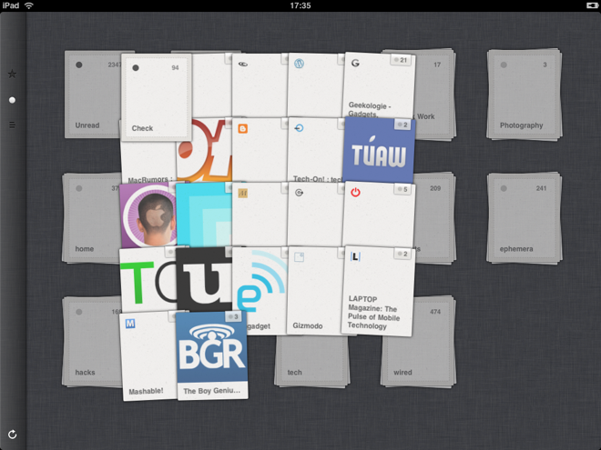
These are apps that I use and or am inspired by for different types of navigation in an app.

iPadReeder.png

twitter_pane1.png

ipad_touches.jpg